All work
Mobile iOS / Android Reed.co.uk 2024

Reed
Combo Apply

Users couldn't find the bulk apply feature. We ran usability research to find out why, redesigned the entry point, and shipped it, driving a 13% increase in applications per user.

Role
Product Designer
Timeline
Q3–Q4 2024
Platform
iOS & Android
Outcome
+13% applications per user

The problem

A useful feature nobody was using

Reed had built a bulk apply feature, Combo Apply, to help job seekers submit multiple applications at once. The business target was clear: increase applications per user from 0.66 to 0.8. But early data showed users weren't engaging with it. They were still applying one job at a time.

Before investing further in the feature, the team wanted to understand why. Were users ignoring it? Not finding it? Not understanding it? I ran a round of moderated usability testing to find out.

"Can users find and use the Combo Apply feature? And if not, why not?"

Research brief, Q3 2024

Research findings

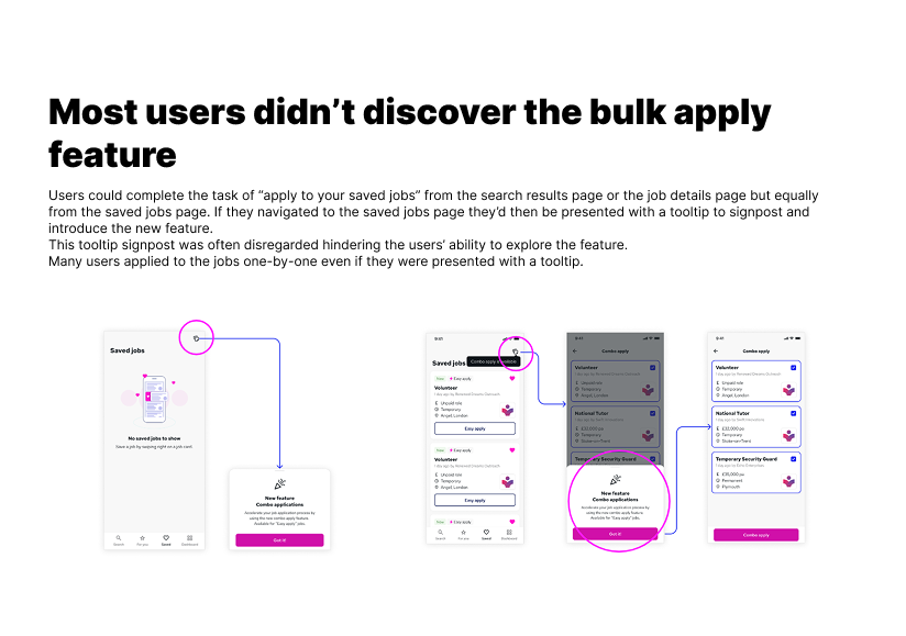
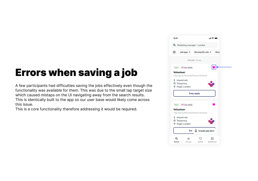
Two things we got wrong

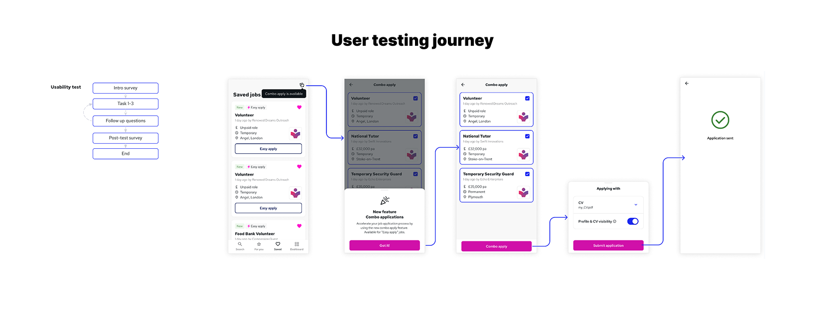
Moderated usability sessions with job seekers across three tasks: save a job, find Combo Apply, submit applications.

Most users didn't discover the bulk apply feature
Errors when saving a job

The core insight

The feature wasn't hidden, it was passive. A tooltip that appears once puts the burden on the user to notice it at exactly the right moment. Most don't. And a broken save button meant users couldn't even build the saved jobs list that Combo Apply depends on.

User testing journey

How we tested the concept

Each session walked participants through the full flow, from an empty saved jobs list through to submitting a Combo Apply. The journey diagram below maps the tasks, decision points and where users dropped off.

User testing journey, Combo Apply concept

The fix

Three changes, no feature rebuild

The research pointed to specific problems. None required rebuilding the feature, only changing how and where it was surfaced.

01
Replace the tooltip with a persistent header CTA
A tooltip that appears once puts the burden on the user to notice it at the right moment. Most don't. Moving Combo Apply into the Saved Jobs page header made it visible on every visit, no timing required.
02
Surface the feature at the moment of intent
Users applied one by one because the feature wasn't there when they were ready to apply. An inline nudge when 2+ jobs are saved met users at the decision point rather than asking them to remember something they'd seen earlier.
03
Fix the save button tap target
Every tester who tried to save a job made an error, the heart icon was below the 44×44pt iOS minimum, causing misclicks that navigated away. This broke the core flow before users even reached Combo Apply.
Working prototype
Try it on your phone
The prototype used in testing is still live. Scan to walk through the Combo Apply flow exactly as participants did during the sessions.
Scan to try the Combo Apply prototype

Outcome

The target moved

+13%
Application growth per user after shipping Combo Apply, moving toward the 0.8 target
0→1
Feature went from near-zero engagement to a measurable share of total applications
3
Specific usability issues fixed before a single line of new feature code was written

The research didn't just validate a hypothesis, it changed what we built. The original plan was to promote the feature harder. The finding was that promotion wasn't the problem, placement was. That distinction saved the team from investing in the wrong solution.

Note: final shipped screens are under NDA. Mockups above represent the design direction approved for development.

Next project

Reed Course Discovery

Redesigning the course card and discovery flow to reduce abandonment and lift enrolment.

Read case study