All work
eLearning B2B Multinational 2020–2021

Sony eLearning
Platform

Designing a centralised training platform for Sony retailers across 15+ countries, reducing content lead times, supporting 11+ languages, and increasing learning conversion by 98%.

Role
UX/UI Designer
Company
Let's Create
Platform
Web App + Mobile
Year
2020–2021

The problem

Cost, speed, and consistency, all broken at once

"We need to get our product information out to our staff and audience as quickly as possible."

Sony stakeholder, project kick-off

Sony needed to modernise how they trained retail staff across Europe. Product information was being distributed slowly and inconsistently, regional teams rebuilt materials locally, introducing delays and version drift. There was no central source of truth, no engagement data, and localisation was a manual rebuild per market.

The brief was clear: build a centralised platform that works across 15+ countries, supports 11+ languages, and can scale without regional production overhead. I was the sole UX/UI Designer on the project at Let's Create, responsible for the learner experience, authoring tools, mobile companion app and analytics dashboard.

What I designed

Four components, one failure point each

The platform wasn't a single product, it was four interconnected surfaces. I designed each one, and each one addressed a different breakdown in Sony's existing workflow.

01
eLearning Training Platform
Structured course browser with SCORM 1.2/2004 compliance, persistent progress indicators, and module-level completion states, designed for retail staff with no prior experience of a learning platform.
02
Mobile Pocket Guide
A lightweight companion app for the shop floor, product specs and key selling points accessible in seconds, without needing to log into a full platform. Always current, zero friction.
03
Authoring & Translation Tools
A content creation system where Sony's central team creates once and pushes to all regions. Translation is a configuration step built into the workflow, not a manual rebuild per market.
04
Analytics Dashboard
A management-facing dashboard giving Sony visibility into completion rates, regional performance and engagement patterns. For the first time, they could see whether training was working, and where it wasn't.

Design process

Research first, then build

I ran stakeholder interviews with Sony's product and marketing teams at the start of the engagement to understand the full scope of the distribution problem. That research directly shaped the architecture decision, build a centralised authoring tool, not a shared file system. One content source, pushed everywhere.

I then reviewed Sony's existing training materials with users to understand what wasn't working from the learner's side: content was too long, structure was unclear, and staff had no sense of progress or where they were in a course. Those three problems became the core design constraints for the learning experience.

01
Requirements
Stakeholder interviews, user feedback analysis, technical audit of existing Sony training infrastructure
02
Concepts
IA mapping, early visual exploration, brand alignment with Sony's Fortune 500 communication standards
03
Build & Test
Staged review checkpoints, security validation, SCORM integration testing across regions
04
Iterate
Three months of aggressive post-launch iteration based on analytics data and user engagement patterns

Web platform, early wireframe

62% complete

Course browser: sidebar category filters, persistent progress tracker, module cards, establishing the core information hierarchy for the eLearning platform.

Mobile pocket guide, early wireframe

Mobile pocket guide: product hero image, key specs in scannable list format, direct CTA, designed for a retail floor context where time and attention are scarce.

Key design decisions

Designing for non-technical users at scale

The platform's primary users were retail staff, people who sell Sony products, not product managers or developers. The design had to be intuitive enough to require no training to use the training platform itself.

Three design principles drove every decision:

  • Clarity over comprehensiveness. Sony's product catalogue is vast. The temptation was to put everything in. We prioritised what retail staff actually needed on the shop floor, key specs, selling points, and course completion, not the full technical datasheet.
  • Progress visibility. Staff needed to know exactly where they were in their training journey. Persistent progress indicators, clear module structures, and completion states were non-negotiable from the first round of user feedback.
  • Localisation as a feature, not a fix. The content architecture was designed around the assumption that all content would exist in multiple languages. Translation wasn't an afterthought, it was built into the authoring workflow from day one.

Final product

What shipped across 15 markets

The eLearning platform, mobile companion app and authoring tooling, all designed from scratch and deployed simultaneously across all regions at launch.

Sony eLearning Platform, course browsing and training interface

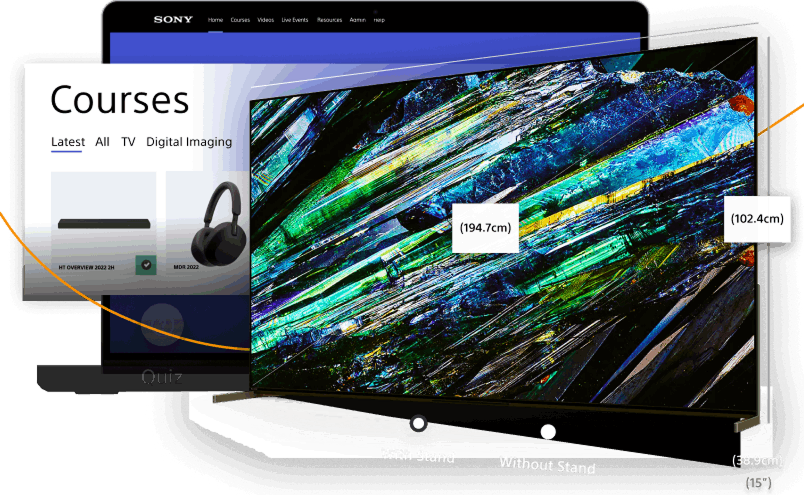
Web platform: the course browser with category filters, progress tracking and structured module navigation.

Sony mobile pocket guide app

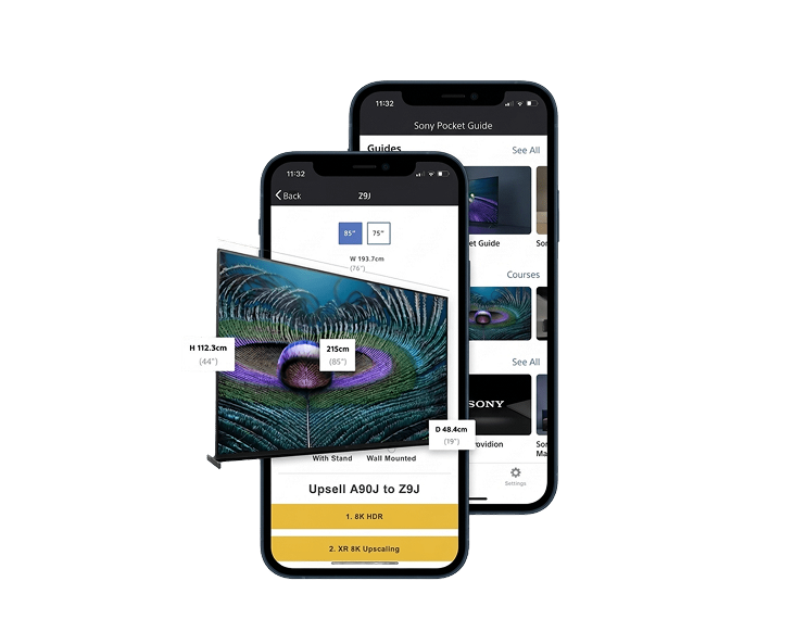
Mobile pocket guide: on-floor access to product specs and key selling points, no desk, no login, no friction.

Sony eLearning Platform, content authoring and course builder

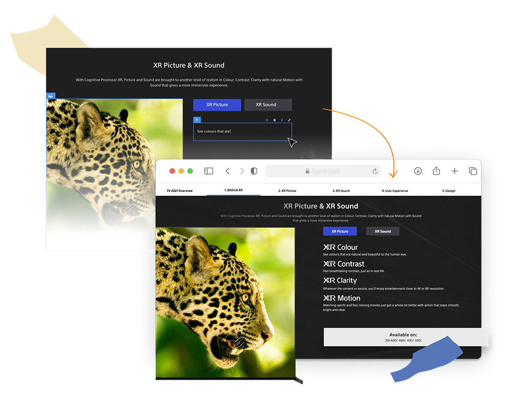
Content authoring environment: Sony's central team creates courses once, configures translations, and publishes to all markets, no regional rebuild required.

Results

Shipped on time, measured to move

98%
Course completion rate, against a pre-platform baseline Sony described as critically low
30+
eLearning courses authored and deployed at launch, across all markets simultaneously
15 countries
11 languages
From a single platform, no regional content rebuild required

The platform launched on budget and on schedule. Before it existed, Sony had no visibility into whether training was being completed at all, the analytics dashboard I designed changed that. Three months of post-launch iteration, driven by real engagement data, refined the experience in ways upfront research couldn't predict.

The hardest design constraint was scale: every component had to hold up across 11 language variants, including languages with significantly longer word lengths than English. The version that ships globally isn't the most locally-polished, it's the most structurally resilient.

Next project

Reed Course Discovery

Redesigning how people find and enrol in courses on Reed.co.uk, a +14% lift in click-through rate.

Read case study